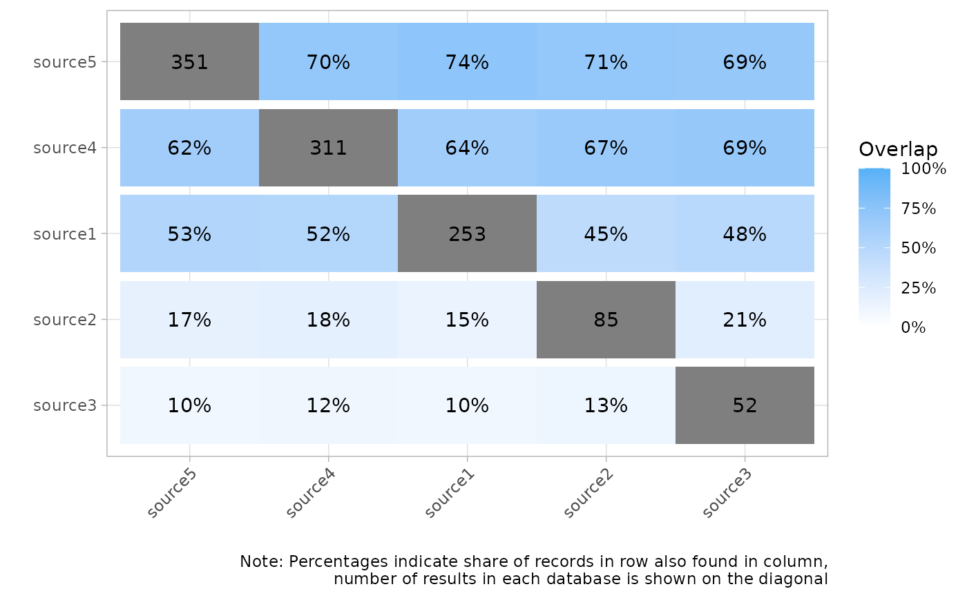
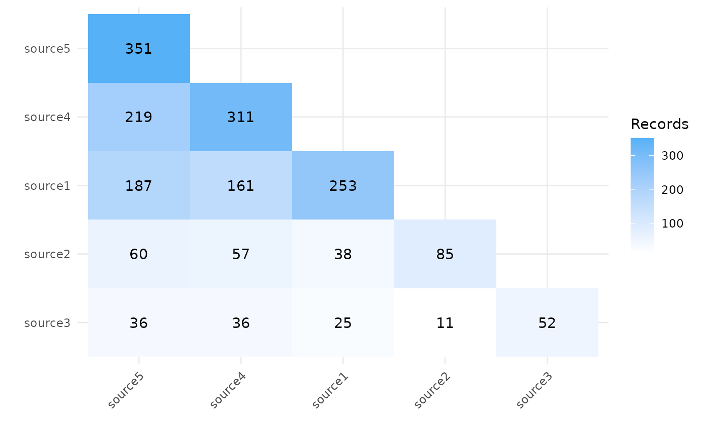
Create a heatmap matrix showing the overlap between sources
Source:R/plots.R
plot_source_overlap_heatmap.RdShow overlap between different record sources, either by showing the number or the percentages of shared records between any pair of sources.
Usage
plot_source_overlap_heatmap(
  data,
  cells = "source",
  facets = NULL,
  plot_type = c("counts", "percentages"),
  sort_sources = TRUE,
  interactive = FALSE,
  show_labels = "auto",
  log_scale = FALSE
)
Arguments
- data
A tibble with one record per row, an id column and then one column per source indicating whether the record was found in that source (usually obtained from
compare_sources())- cells
Variable to display in the cells. Should be 'source', 'label' or 'string'
- facets
Variable in data used for facets (i.e. sub-plots). Should be NULL, 'source', 'label' or 'string'
- plot_type
Either
counts(number of shared records) orpercentages(share of overlapping records).- sort_sources
Should sources be shown based on the number of records they contained? If FALSE, order of data is retained.
- interactive
Should returned plot be interactive and enable user to export records underlying each field?
- show_labels
Whether to show text labels in cells.
"auto"(default) shows labels when there are 10 or fewer sources;TRUEalways shows them;FALSEhides them.- log_scale
Should the fill colour scale be log-transformed? Useful when counts vary greatly across cells. Ignored when
plot_type = "percentages".
Value
The requested plot as a either a ggplot2 object (when interactive = FALSE), which can then be
further formatted or saved using ggplot2::ggsave(), or a plotly object when interactive = TRUE
Examples
data <- data.frame(
article_id = 1:500,
source__source1 = rbinom(500, 1, .5) == 1,
source__source2 = rbinom(500, 1, .2) == 1,
source__source3 = rbinom(500, 1, .1) == 1,
source__source4 = rbinom(500, 1, .6) == 1,
source__source5 = rbinom(500, 1, .7) == 1
)
plot_source_overlap_heatmap(data)
 plot_source_overlap_heatmap(data, plot_type = "percentages")